Prestel, Japan’s Best Friend
‘Japan’s Best Friend: Dog Culture in the Land of the Rising Sun’ is a new title by Manami Okazaki for Prestel Publishing, edited by Ali Gitlow and designed by SOUP’s Nina Jua Klein and spreeeng’s John Philip Sage. The book explores how dogs have permeated Japanese life, from historical themes to contemporary visual culture.
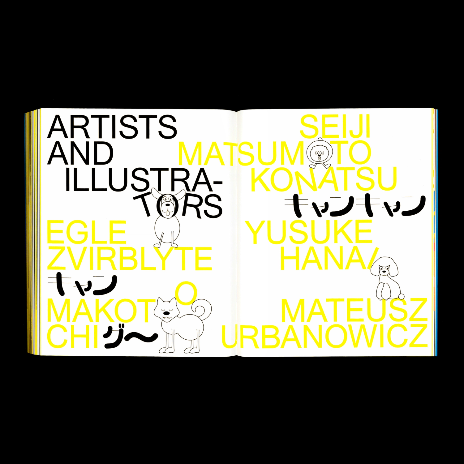
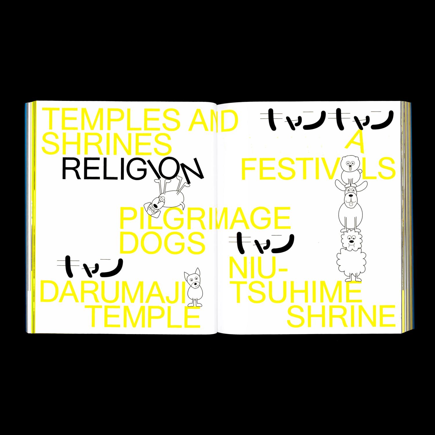
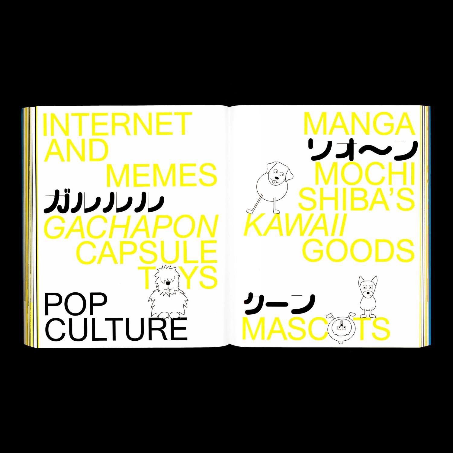
The joyful content of the book is reflected in its design – playful, colourful and energetic. To offset the clean simplicity of Radim Pesko’s Union typeface, used throughout the book, we developed a set of dog drawings. We think of them as a cheeky gang of characters, which complement but also disrupt the typography – replacing, displacing or playfully interfering with various elements on the page.
The Katakana typeface, called Kachi-Buwa, designed by Emi Takahashi a Toronto-based graphic and type designer, felt like a perfect addition to the visual language. Kachi-Buwa ‘investigates how design can communicate the nuances in connotations and culture-specific context expressed by onomatopoeia in the Japanese language’, allowing us to include various Japanese expressions of sound, specific to dogs.
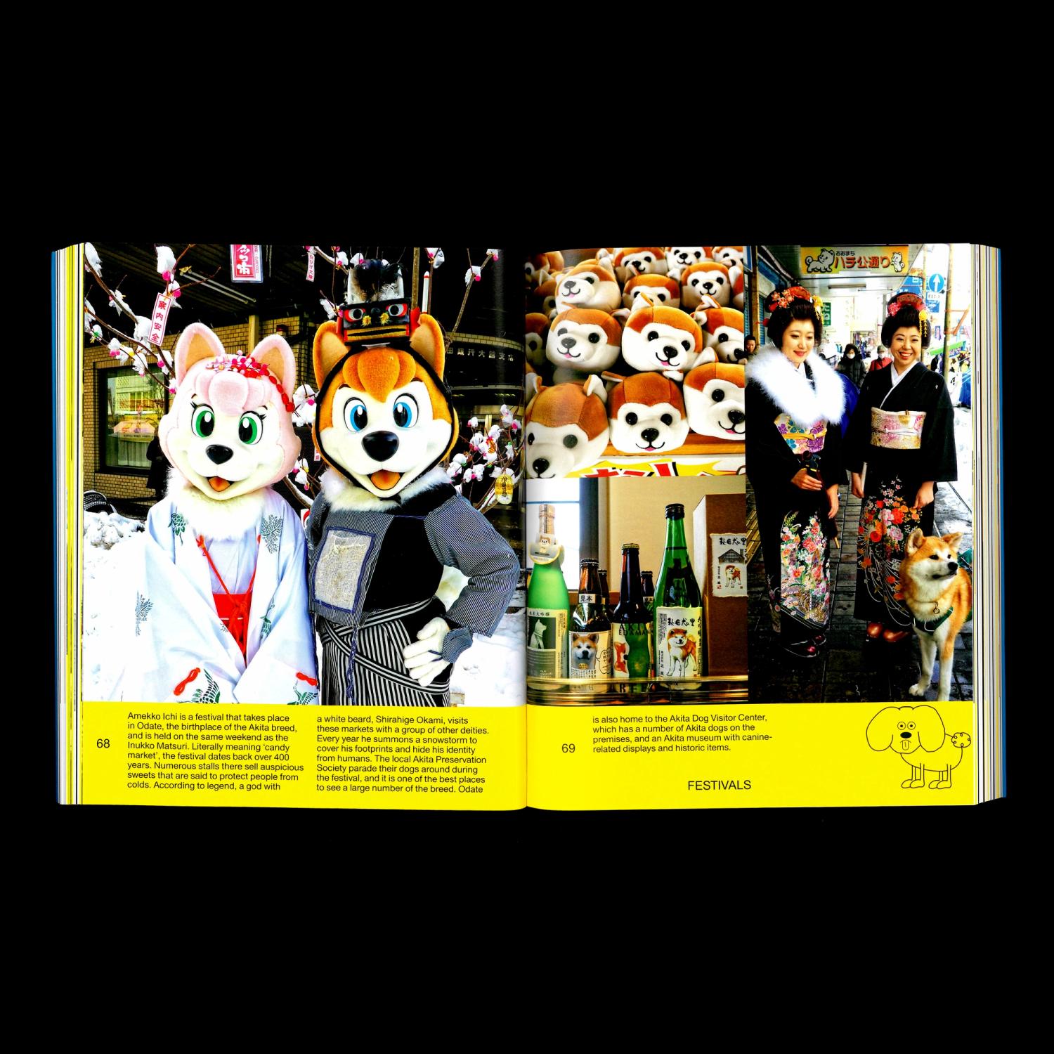
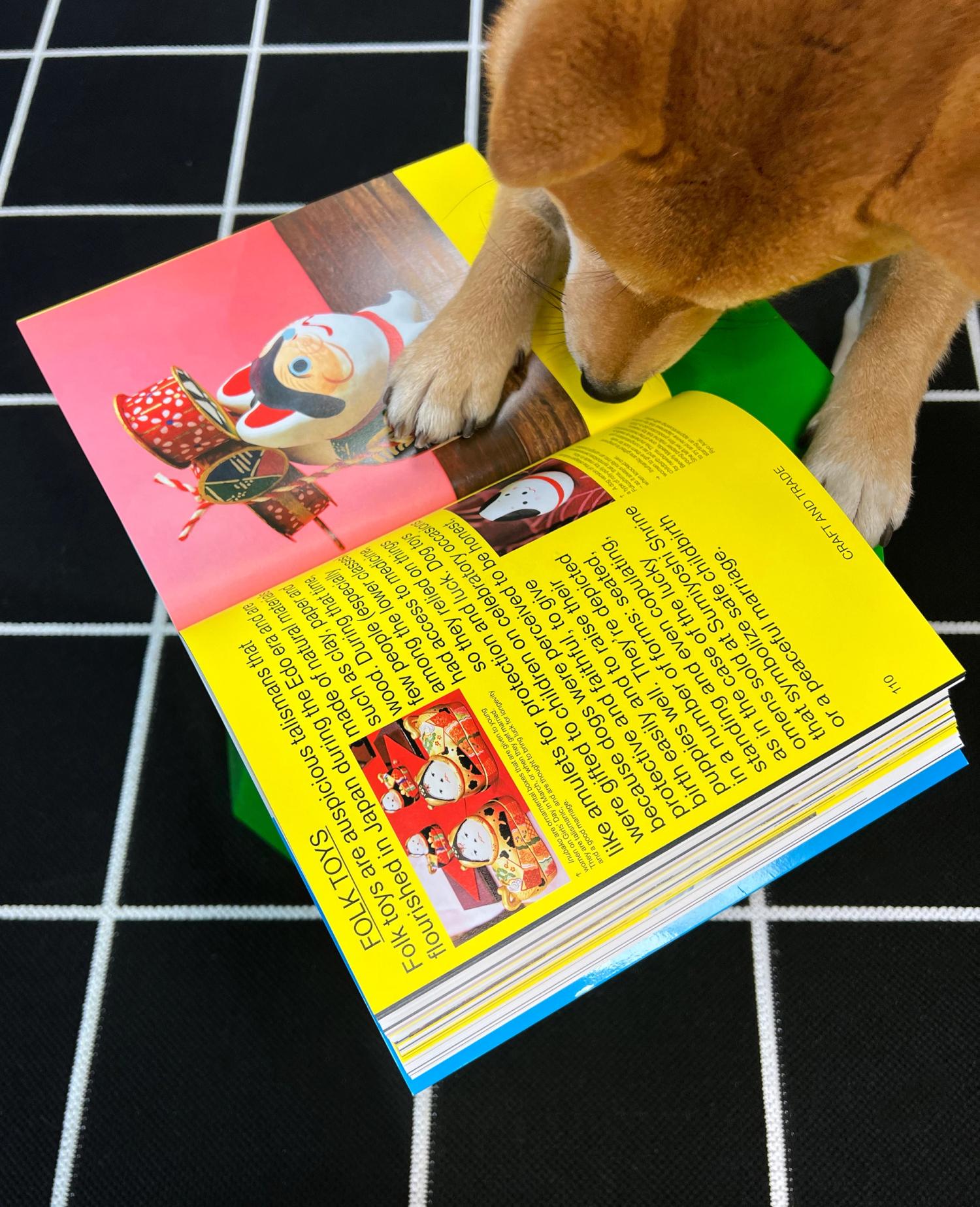
To amplify but also unify the vibrant and diverse content of the book we replaced the yellow colour channel of the four colour print with a fluorescent yellow Pantone, allowing us to use a spot colour within budget. This substitution gave us the opportunity to use the solid yellow Pantone throughout the book but also to add vibrancy to the imagery.
- Date
- 2022
- Design
- Nina Jua Klein (SOUP), John Philip Sage (spreeeng)
- Author
- Manami Okazaki
- Editor
- Ali Gitlow
- Publisher
- Prestel Publishing
- Typefaces
- Kachi-Buwa by Emi Takahashi