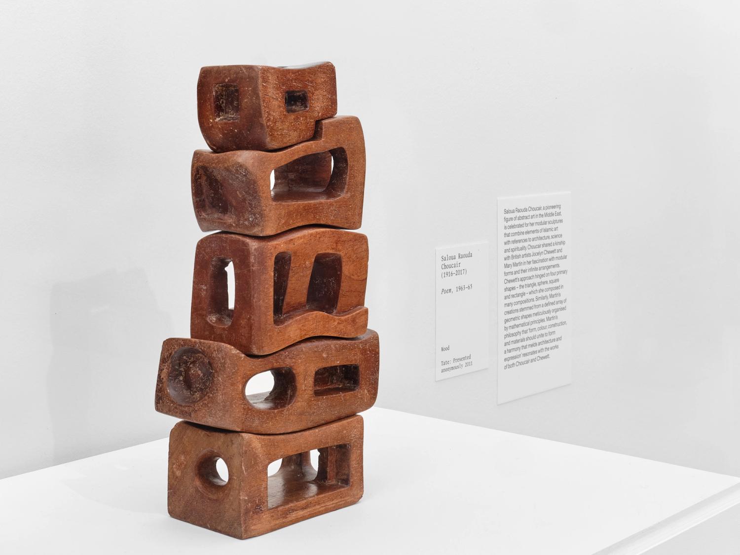
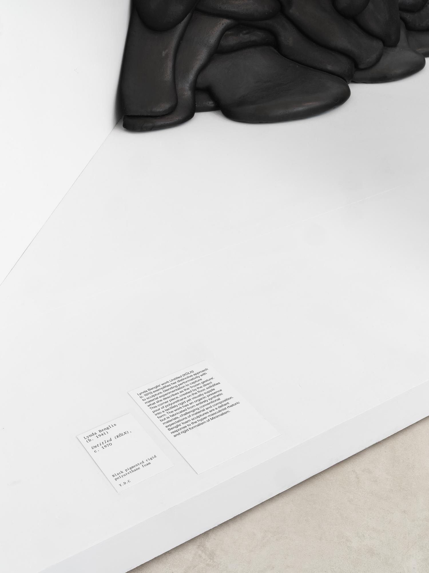
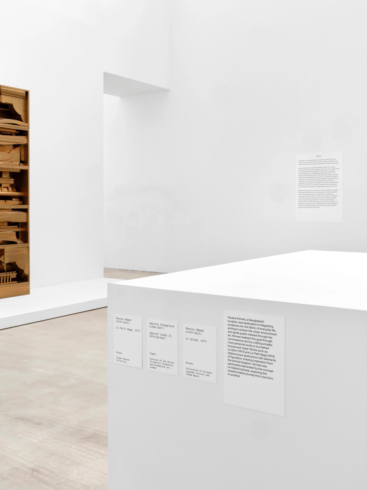
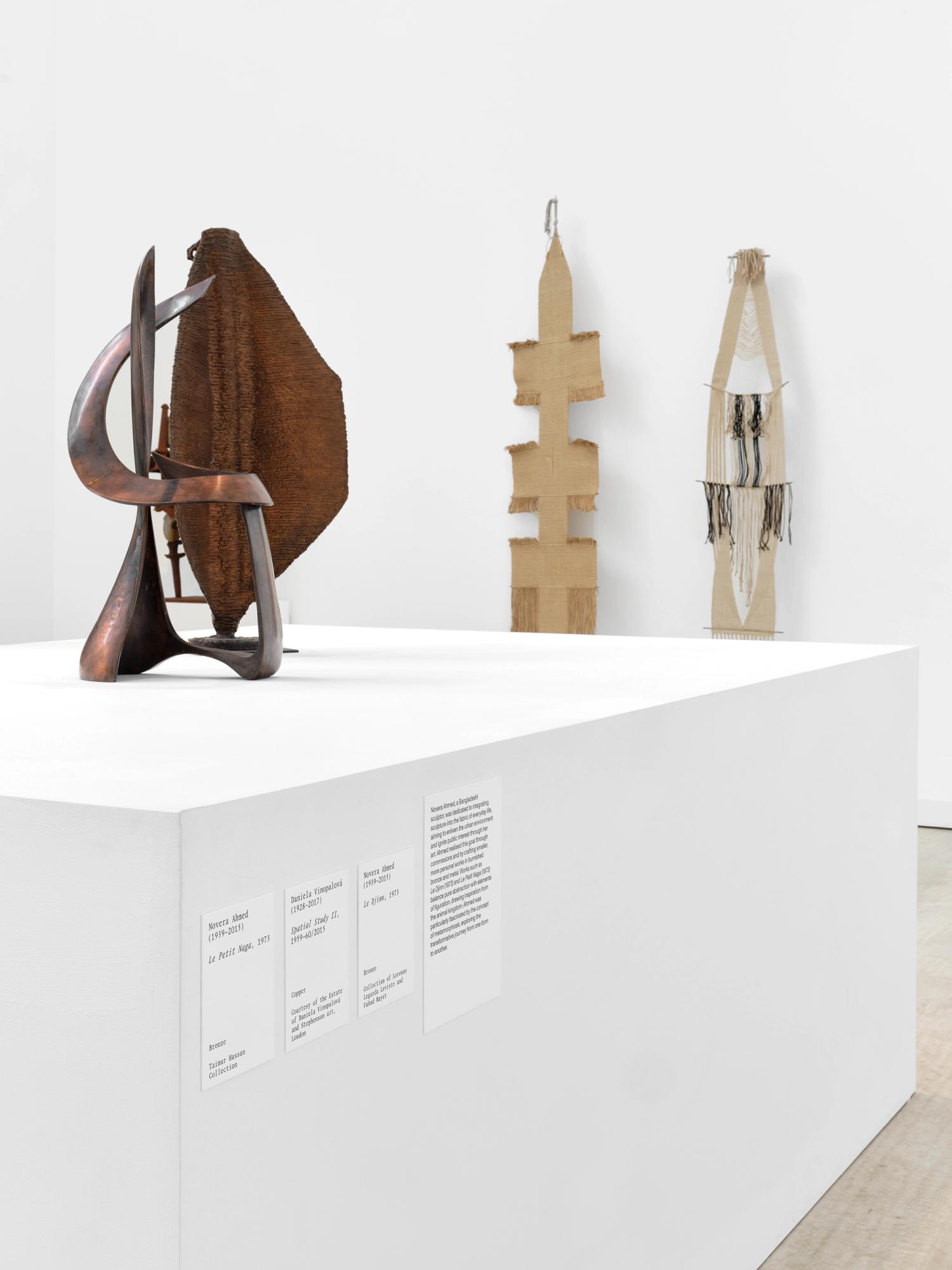
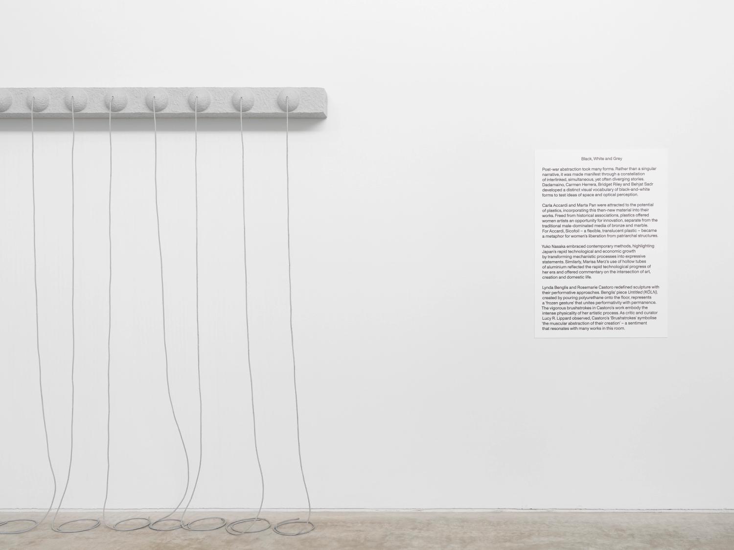
Turner Contemporary, Beyond Form
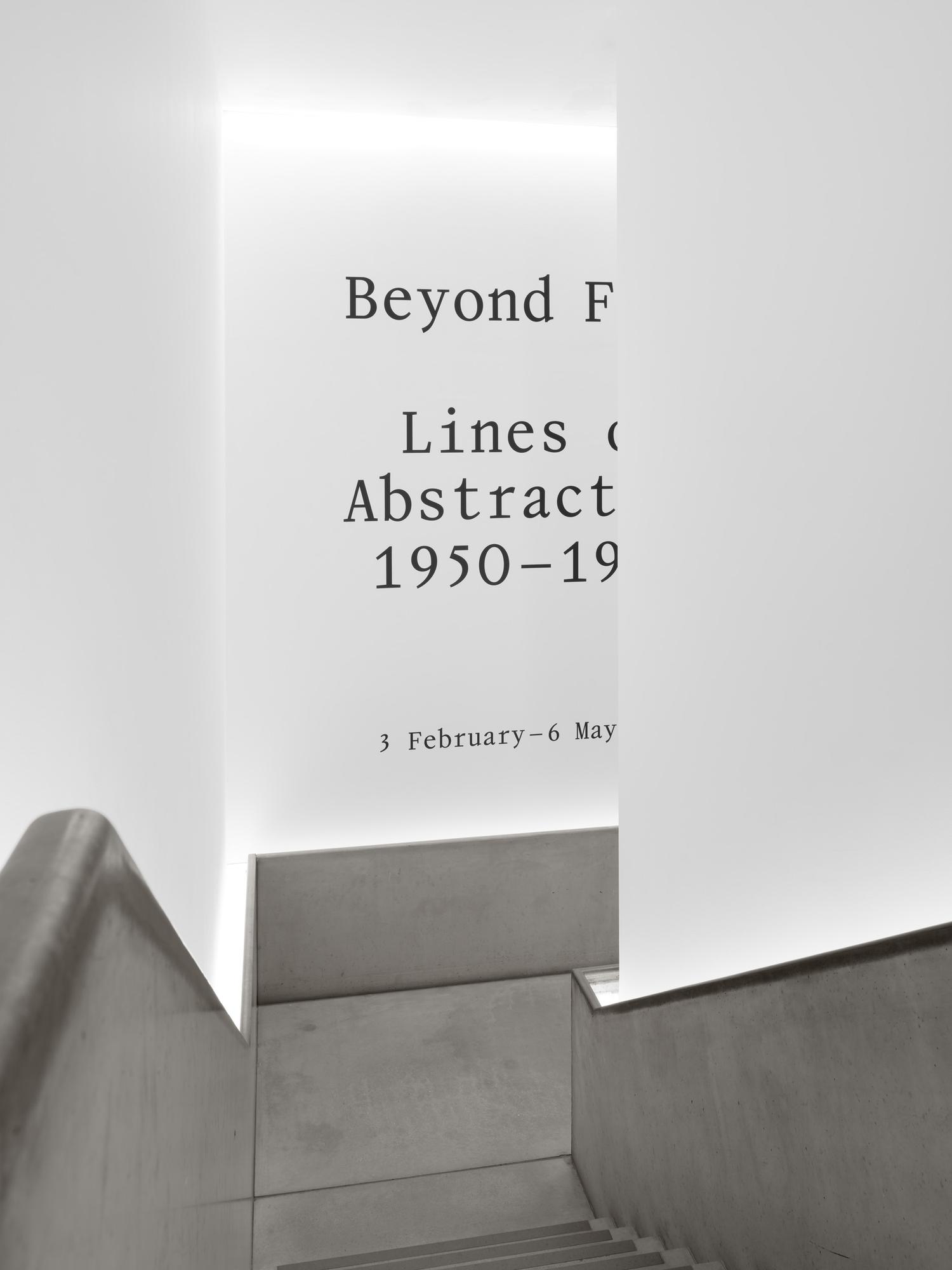
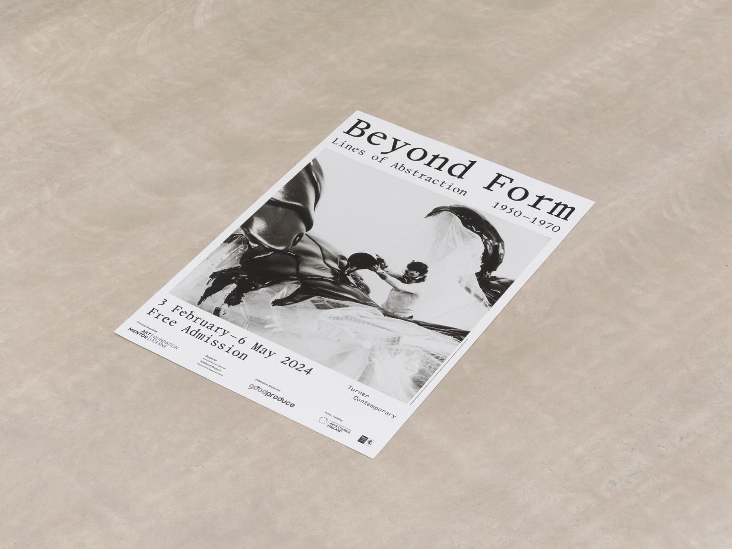
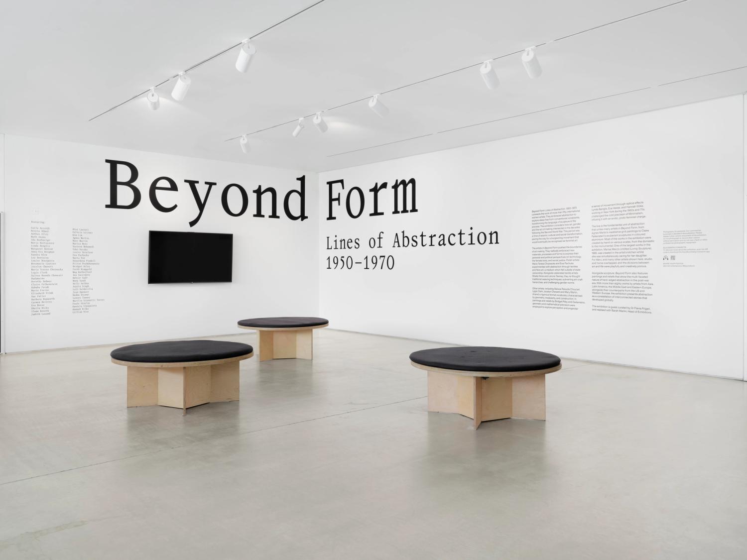
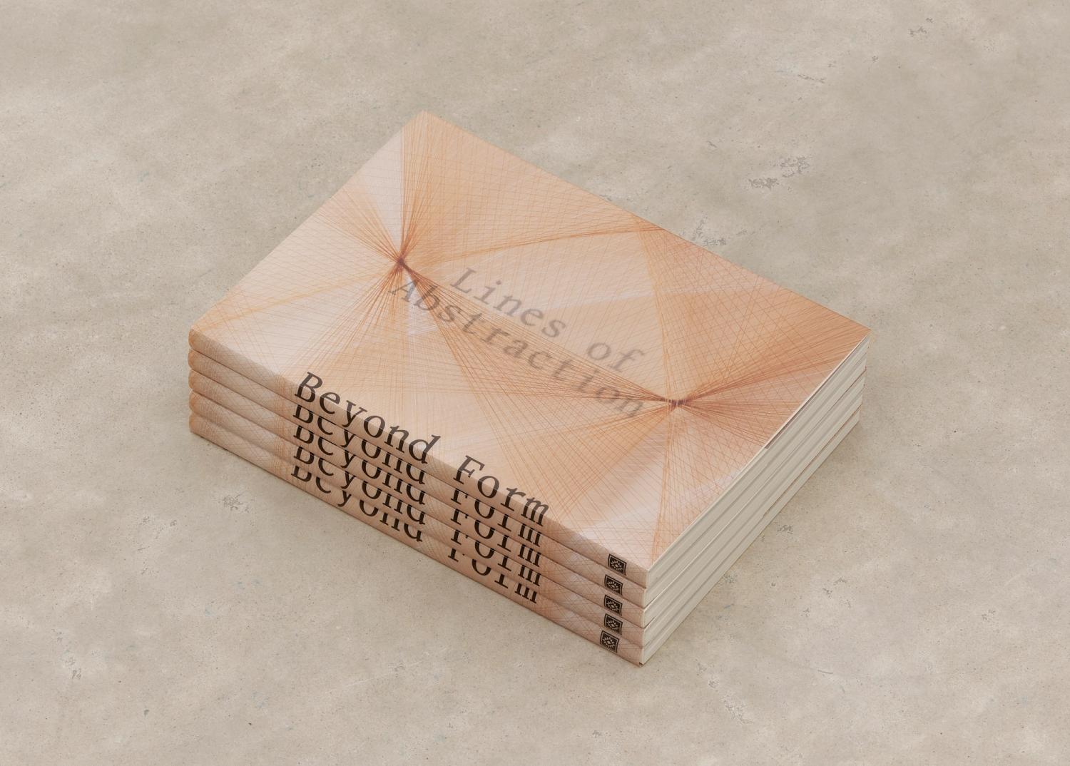
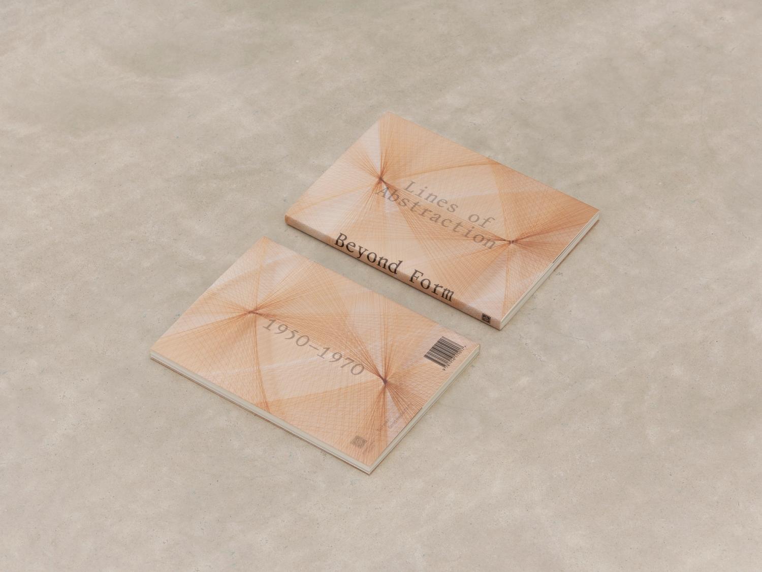
For the exhibition 'Beyond Form: Lines of Abstraction, 1950–1970', we were invited by Turner Contemporary to create a graphic identity to carry across the design of the catalogue, exhibition graphics, and marketing. Following the exhibition’s intention to highlight pioneering female artists and designers, we chose a distinctive typeface by Sophie Wietlisbach, which lends its elegant but striking monospaced characters to the exhibition title.
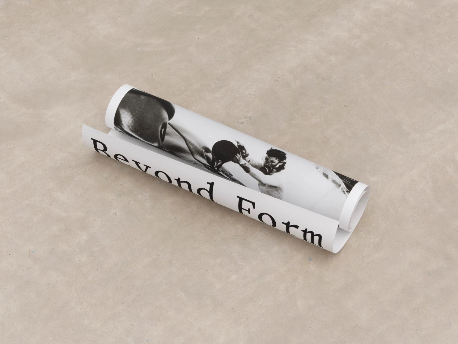
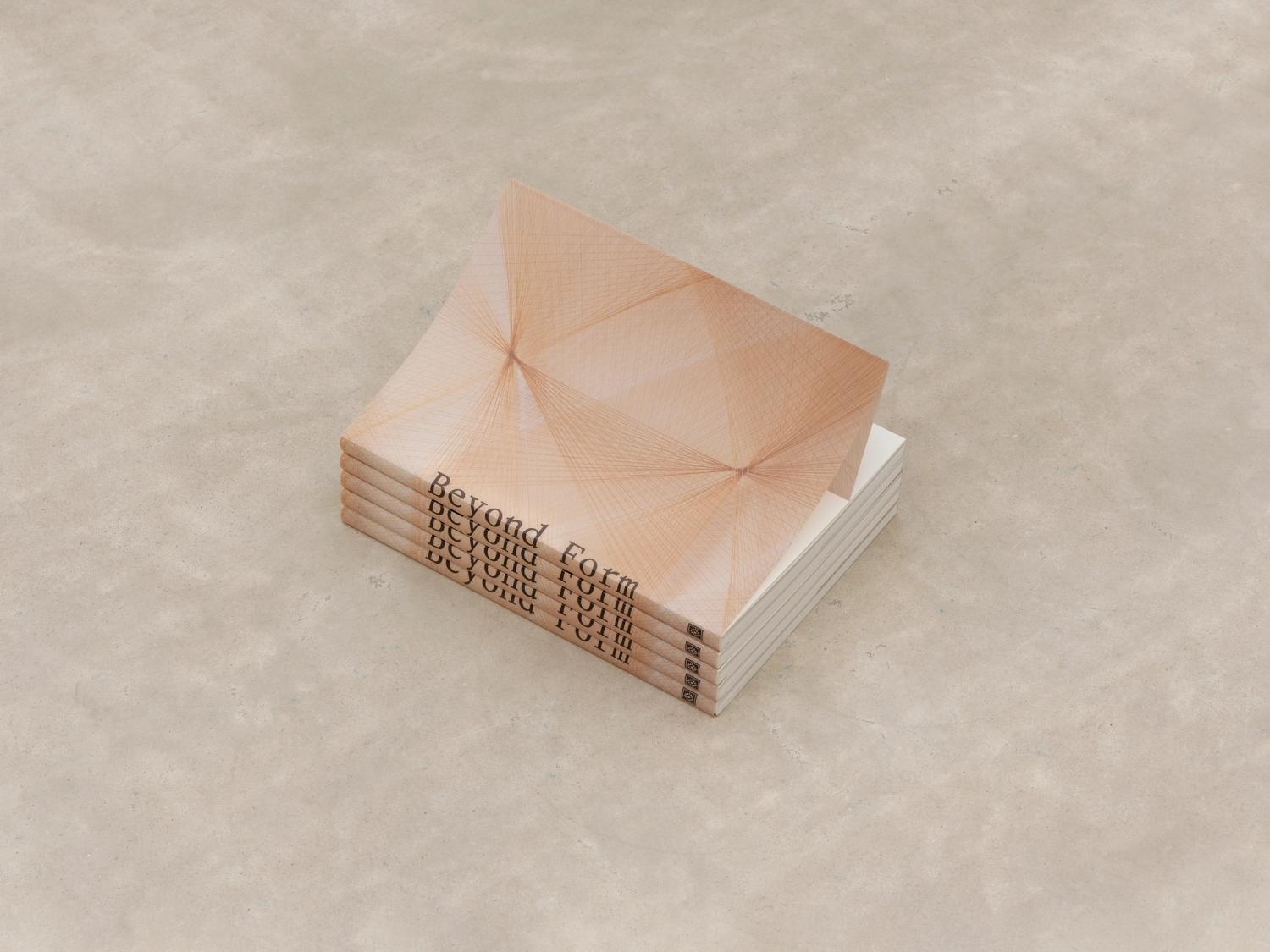
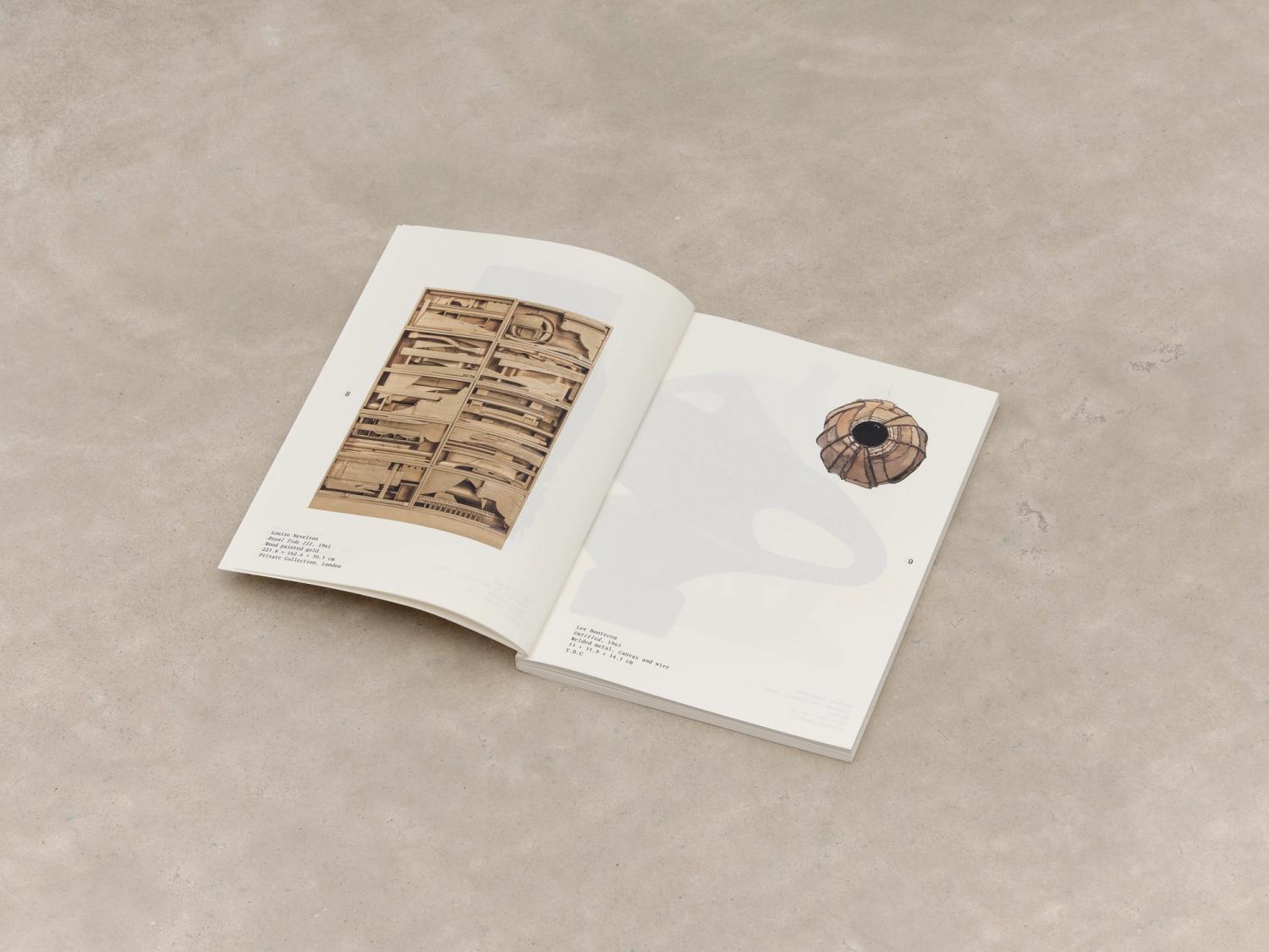
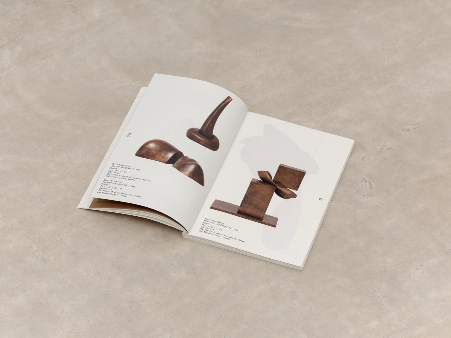
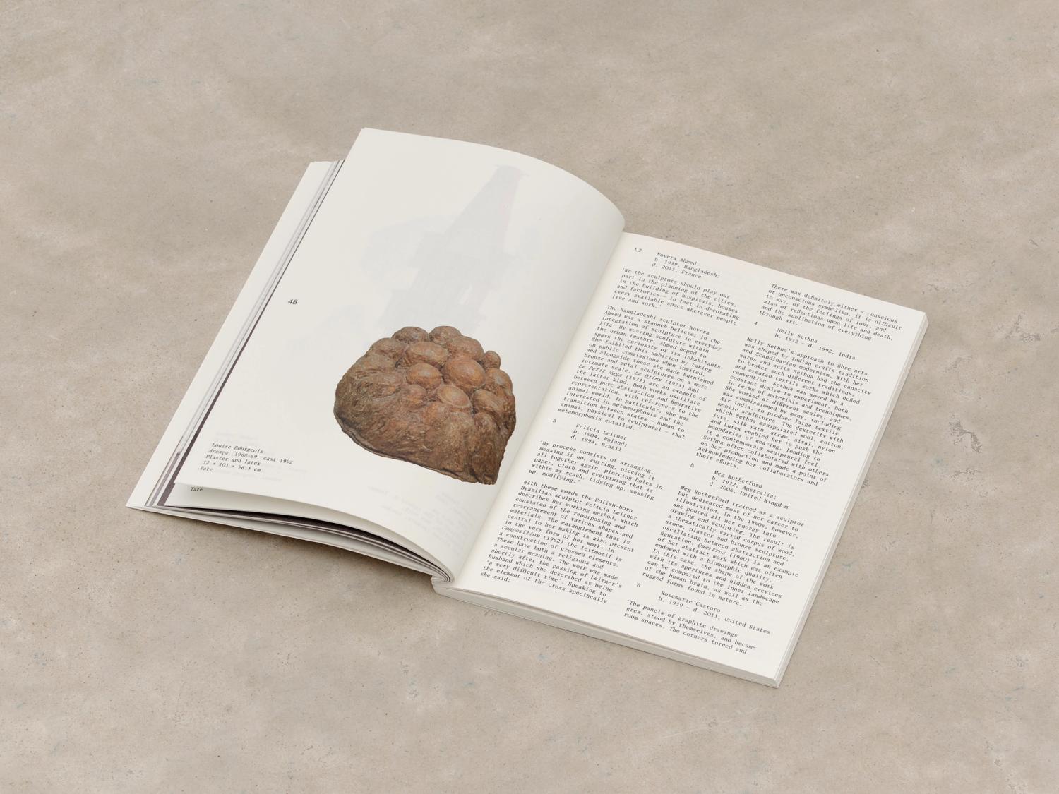
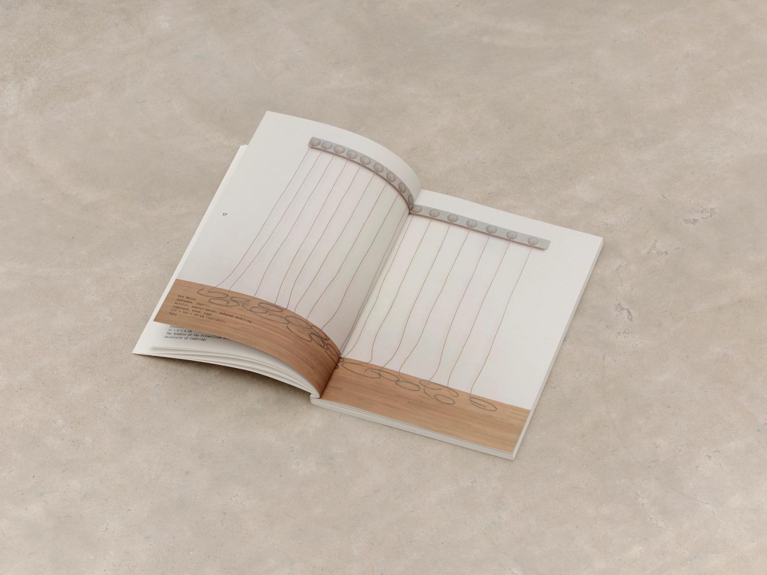
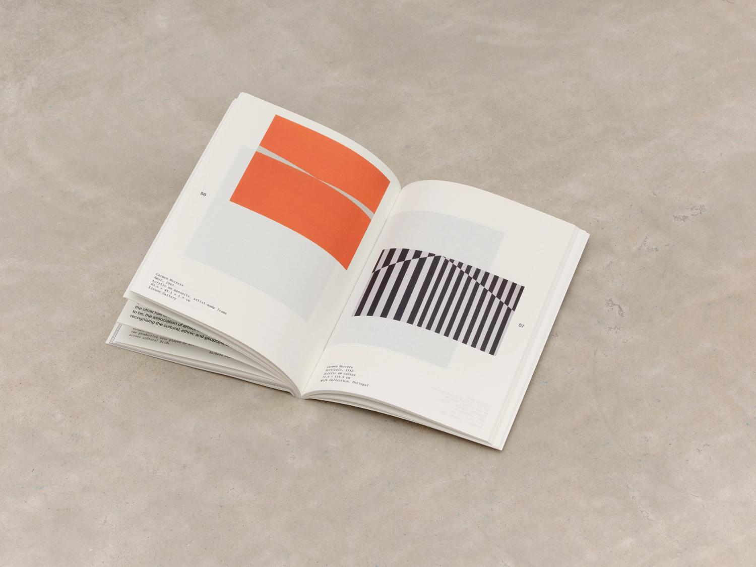
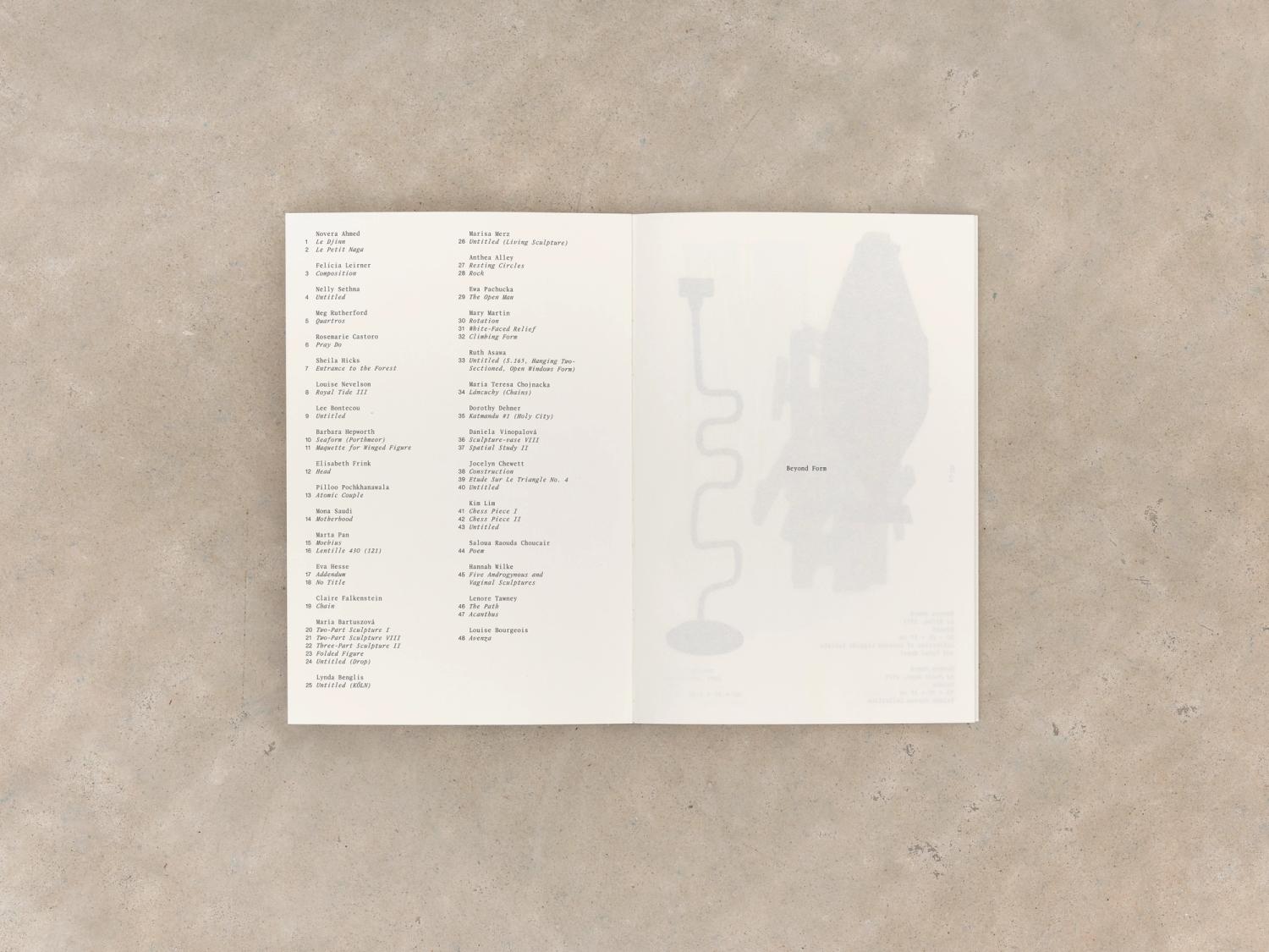
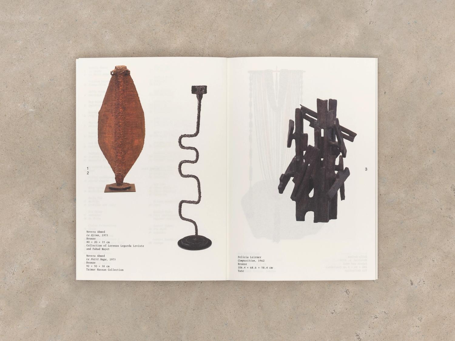
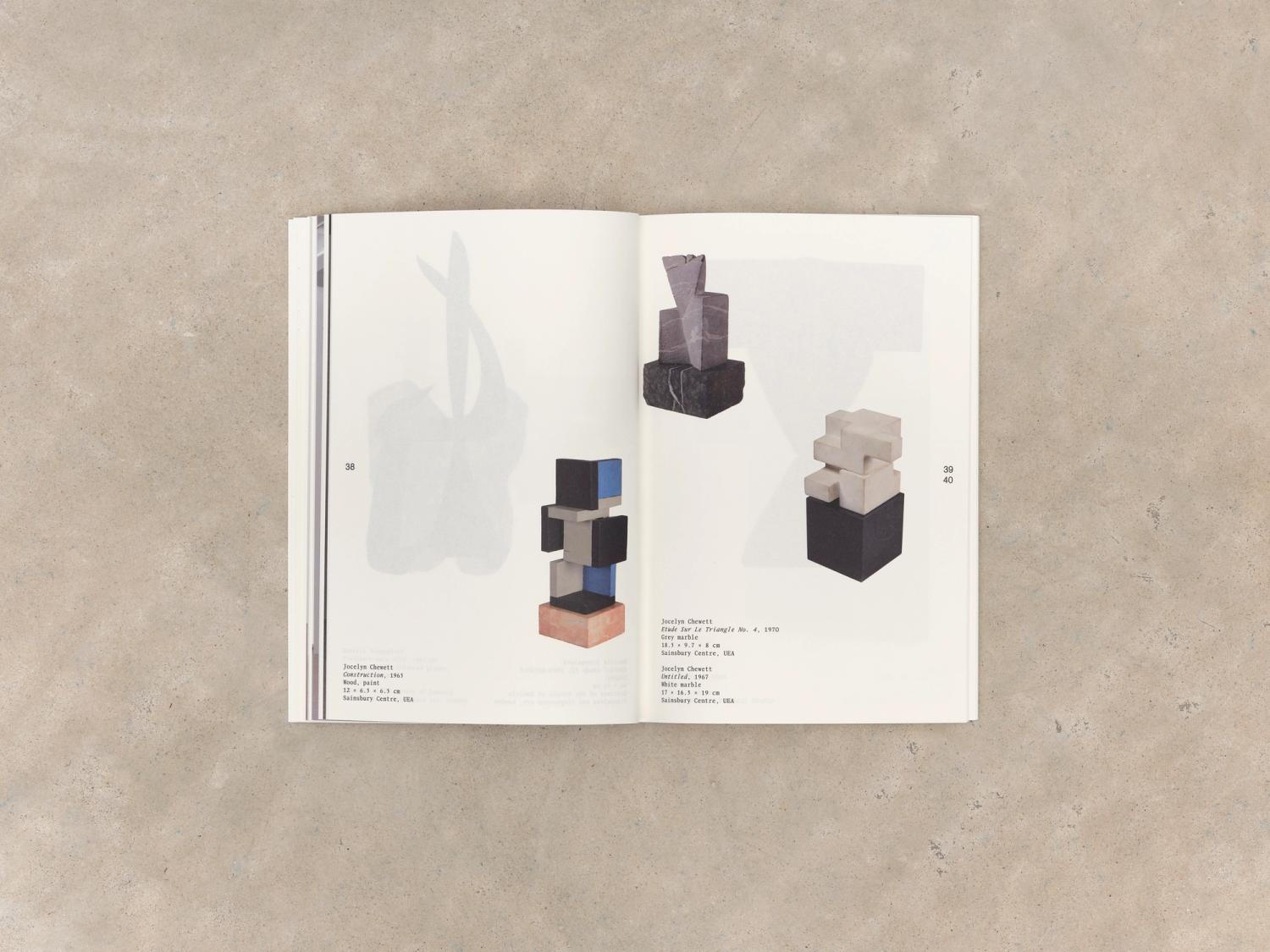
The catalogue was produced with great consideration of materials, responding to the artworks within. We chose a lightweight stock to use throughout the image section, which enabled careful juxtaposition of works between layers of pages as you discover the works. We liaised closely with the curators to create meaningful harmony between the pieces, in a way that mimicked the narrative experienced as visitors explored the exhibition space. An even lighter stock provided a dust jacket that celebrated the formal qualities of the incredibly delicate cover artwork, and a title treatment that alludes to the layering within the book. We established a numerical referencing system to link artists’ texts to their works, allowing us to maintain distinct image and text sections, maximising the form of each work.
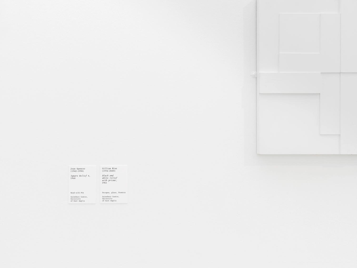
The book came to life in the exhibition, where we carried the typographic language to the graphical interpretation panels and title graphics, working with local producers for the print production. We adapted the identity to respond to the gallery space, with the title wrapping around two adjacent walls, in a way that mimicked the placement of the title across the edge of the spine of the book.
- Date
- 2024
- Author
- Flavia Frigeri
- Publisher
- Eiderdown Books
- Typeface
- Review Mono by Sophie Wietlisbach for ECAL Typefaces
- Typeface
- Monument Grotesk by Dinamo